
Did you know that physical mail remains in the average American home for 17 days? While digital ads are swiped away in a fraction of a second, a tangible mailer creates a lasting connection that customers can actually hold. You’ve likely felt the sting of low response rates from generic designs that fail to follow direct mail design best practices. It’s stressful to worry about complex USPS size regulations or the high cost of a design error. You need a campaign that works the first time without the headache.
This guide will show you how to master the science of high-impact creative to ensure your marketing spend delivers a massive ROI. We’ll provide a clear framework for designing postcards and tri-folds that stand out in any mailbox across the country. You’ll learn how to bridge the gap between physical mail and digital ads using modern triggers like Connected TV and mobile integration. We handle the complexity so you can focus on the results. Let’s transform your mailers into a high-conversion engine.
Key Takeaways
- Understand how the tangibility of physical mail builds deeper brand trust and stays in homes longer than fleeting digital advertisements.
- Master direct mail design best practices by using a clear visual hierarchy and the “Three-Second Scan” to ensure your message is seen and understood instantly.
- Learn to integrate digital triggers like QR codes and Mail-to-Mobile texting to create a seamless path from the mailbox to a digital conversion.
- Identify the best mailer format for your goals, whether it is the high-visibility 6×11 Impact Post Card or a detailed Massive Menu Trifold.
- Discover the benefits of a turnkey national strategy that handles design, printing, and postage to remove the stress of complex USPS regulations.
The Strategy of Tangibility: Why Direct Mail Design Still Wins
Digital fatigue is a real problem for your customers. They see thousands of ads every day on their screens. Most of those ads are forgotten instantly. Direct mail is different because it is tangible. It creates a physical connection that digital channels simply cannot match. High-impact direct mail design best practices focus on this physical advantage to build brand trust and drive response. We help businesses across all 50 states leverage this tangibility to generate real demand.
The History of advertising mail shows that physical delivery has always been about making a personal connection. Today, we use data-driven precision to make that connection more effective. Unlike a fleeting email, a well-designed postcard becomes a permanent fixture in a household. It’s not just mail; it’s a physical handshake with your prospect. It demands attention because it occupies physical space in the real world.
The Psychology of Physical Mail
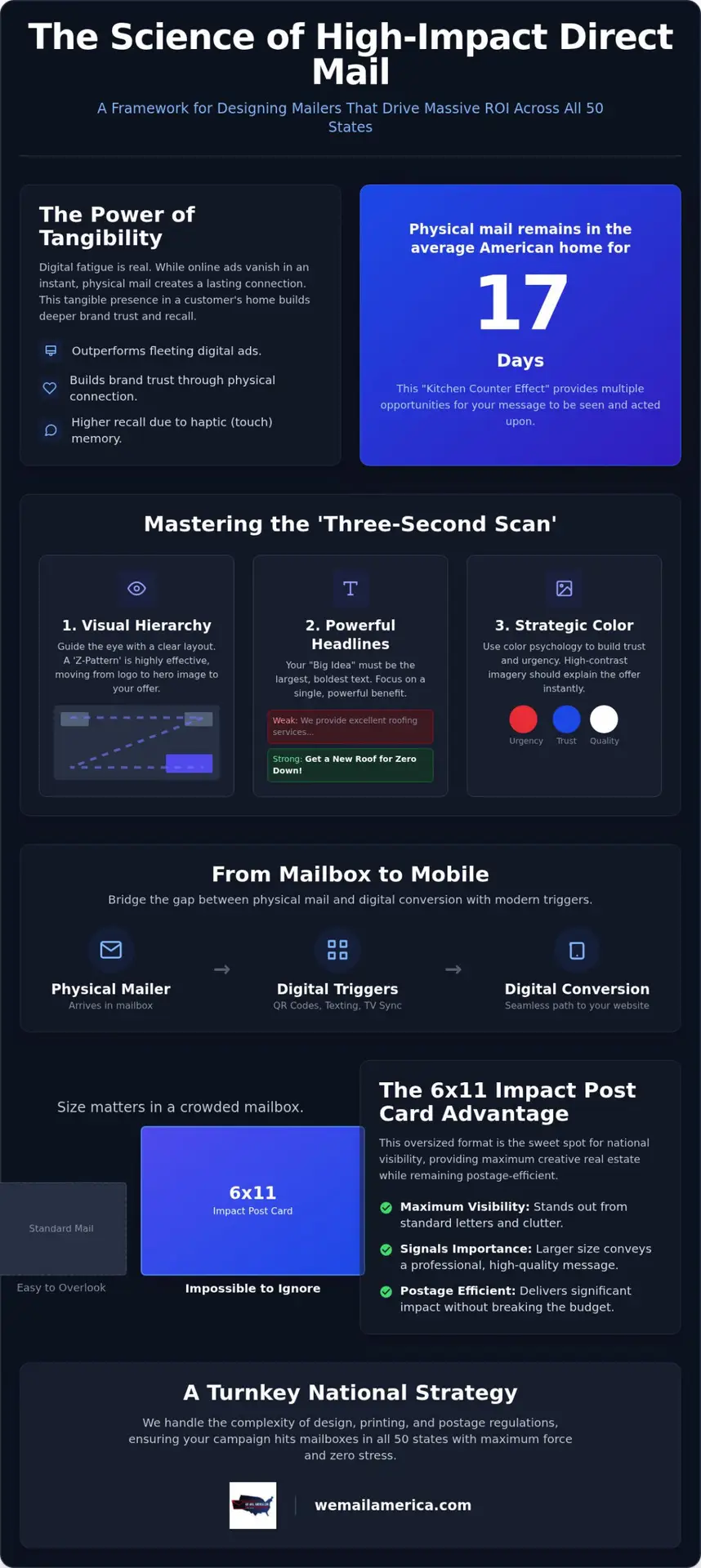
Science backs the power of touch. Haptic memory ensures that when a person holds a postcard, their brain registers the brand with higher recall. This is why physical mail often outlasts any digital campaign. The Kitchen Counter Effect is a proven phenomenon where advertising mail stays in the home for an average of 17 days. This extended lifespan gives your message multiple opportunities to be seen and acted upon. Tangibility is the primary differentiator of direct mail.
The 6 x 11 Impact Post Card Advantage
Size matters in a crowded mailbox. The Impact Post Card (6×11) is the sweet spot for national visibility. It is significantly larger than a standard letter, which makes it impossible to ignore. This format provides maximum creative real estate while remaining highly efficient for postage. It signals a level of importance and professional quality that smaller cards lack. When you use an oversized format, you tell the recipient that your message deserves their attention.
We handle everything from the initial design to the final mailing. This ensures your campaign hits mailboxes in all 50 states with maximum force. Our turnkey approach removes the stress of design mistakes and ensures your brand looks its best. By following proven direct mail design best practices, you turn a simple piece of cardstock into a high-conversion engine that dominates the mailbox.
Mastering Visual Hierarchy: Designing for the ‘Three-Second Scan’
Your customer stands at the mailbox. They shuffle through a stack of envelopes and flyers. You have exactly three seconds to win their attention before your message hits the recycling bin. Mastering visual hierarchy is the only way to stop the shuffle. By following direct mail design best practices, you transform a standard piece of mail into a high-impact tool that demands focus and drives immediate action.
The “Big Idea” headline must be your primary focal point. It should be the largest, boldest element on the page. Use high-contrast imagery that supports this headline perfectly. If the image doesn’t explain the offer at a glance, it doesn’t belong on the card. White space is your best friend in this process. It isn’t just “empty room.” It’s a deliberate tool used to guide the eye toward your most important information without overwhelming the recipient.
Effective layouts usually follow an F-pattern or a Z-pattern. For oversized pieces like our Impact Post Card, the Z-pattern is highly effective. The recipient’s eye starts at the top left, moves across to your logo, drops diagonally through your hero image, and lands on your call to action at the bottom right. This natural flow ensures they see the most critical parts of your message in those first few seconds of engagement.
Headlines That Demand Attention
Write headlines that pack a punch. Use short, declarative sentences. Instead of saying “We provide excellent roofing services for homeowners,” try “Get a New Roof for Zero Down.” Focus on one powerful benefit that solves a specific problem. Readability must always come before style. Use bold, sans-serif fonts that are easy to scan from a distance. If a customer has to squint to read your offer, you’ve already lost the conversion.
Color Psychology and Brand Trust
Color choice heavily influences how customers feel about your business. High-energy colors like red or bright orange create a sense of urgency. These are perfect for your “Call Now” or “Scan Here” buttons. We also lean into patriotic pride in our creative work. Using a red, white, and blue palette signals American-made quality and reliability. This builds immediate trust with audiences across all 50 states.
Consistency is vital for national campaigns. Your mailers should match your digital presence perfectly. Many businesses find success by integrating direct mail with digital marketing to create a unified brand experience. This multi-channel approach reinforces your authority and keeps your brand top-of-mind long after the mail is sorted. You can start your high-impact campaign today with a professional team that understands exactly what drives response. We handle everything so you can focus on your ROI.
Bridging the Gap: Integrating Digital Triggers into Physical Design
Physical mail doesn’t exist in a vacuum. It works best when it acts as a launchpad for your digital presence. Modern direct mail design best practices now include “Mail-to-Mobile” strategies that drive instant action. We help you turn a physical postcard into a digital portal. This integration ensures your brand dominates both the mailbox and the smartphone screen simultaneously. It’s a turnkey solution for businesses wanting a national reach with modern precision.
Connected TV (CTV) coordination is a powerful way to reinforce your message. Imagine a customer seeing your commercial on their television and then finding your Impact Post Card in their mailbox the next day. This multi-touch approach builds massive brand authority across all 50 states. We use personalized URLs (PURLs) to track this behavior. When a recipient visits their unique link, you get real-time data on who is engaging with your campaign. This data allows you to refine your strategy and increase your ROI.
Designing for the QR Code Era
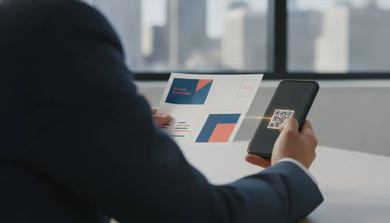
QR codes are the most efficient way to bridge the physical-digital divide. Placement is critical for success. We recommend placing codes in the “Thumb Zone” at the bottom corners of the mailer. This makes it easy for a recipient to scan while holding the card. Provide a clear, high-energy instruction next to the code. Phrases like “Scan to Save” or “Scan for Video” tell the customer exactly what to do. A well-placed QR code turns physical mail into a digital portal that captures leads instantly.
Omnichannel Visual Consistency
Your postcard design must match your digital footprint. Use the same color palettes, fonts, and hero imagery across your mailers, mobile ads, and email headers. This consistency removes friction for the customer. When they scan your card and land on your website, they should feel like they are in the same place. The Impact Post Card (6×11) serves as the anchor for this multi-touch campaign. Its large format provides enough room for bold visuals and digital triggers without looking cluttered. Learn more about our integrated advertising services to see how we handle everything for your national campaign. We make sure your message is seamless and impactful from the first touch to the final conversion.
Format Selection: Matching Design to Your Campaign Objectives
Success in direct mail starts with picking the right tool for the job. Your choice of format dictates how much information you can share and how much attention you’ll grab. Following direct mail design best practices means matching your creative layout to your specific campaign goals. Whether you want a quick surge in leads or need to educate a new market, the physical shape of your mailer matters. We provide a range of oversized options designed to win in any mailbox across all 50 states.
The Impact Post Card (6×11) is our most popular choice for a reason. It offers a perfect balance between visibility and cost-efficiency. If you want to truly dwarf the competition, the Mailbox Buster Post Card (12×9) provides a massive canvas for high-contrast imagery. Every format has specific technical requirements that can make or break your campaign. Professional results require attention to the fine details of print production:
- Bleed requirements: Extending your design past the trim line to prevent unsightly white edges.
- Clear zones: Keeping critical text and logos away from the barcode areas required by USPS sorting machines.
- Folding accuracy: Aligning graphics perfectly with scores on tri-fold mailers to ensure a seamless look.
We handle these technical details in-house so you don’t have to worry about design mistakes that waste your budget. Our turnkey service ensures your vision translates perfectly from the screen to the mailbox.
Postcards vs. Tri-Folds: The Choice Framework
Use postcards for high-frequency demand generation. They are perfect for bold headlines and singular, powerful offers that drive immediate action. Tri-folds are the better choice for high-information campaigns. If you’re a service provider explaining a complex process or a restaurant sharing a full menu, the Massive Menu Trifold (10×21) or Sizeable Trifold (10×17) provides the necessary space. These formats allow for a logical flow of information that guides the reader toward a conversion. Check out The Ultimate Guide to High-Impact Brochures for more details on these multi-panel designs.
Oversized Mailers: When Bigger is Better
Oversized mailers like the 9 x 11 Extra Large Card dominate the physical mailbox environment. They stand out because they don’t fit neatly into the stack of standard envelopes. For maximum market saturation, The Giant Post Card (10×14) is an unbeatable option. It demands to be read. While these formats are larger, we maintain postage efficiency through our specialized mailing processes. This ensures your campaign remains cost-effective while delivering maximum impact. You can request a custom quote for your oversized campaign today. We manage the design, printing, and postage to ensure a seamless experience for your business.
From Concept to Mailbox: Scaling Your National Design Strategy
Launching a campaign across all 50 states requires more than just a good idea. It requires a repeatable system that ensures quality and compliance at scale. When you follow direct mail design best practices, you remove the guesswork from your marketing budget. We provide a turnkey solution that takes your concept from a rough draft to a high-impact mailer delivered to thousands of front doors. This isn’t just about printing; it’s about executing a nationwide strategy without the common headaches of logistics and regulation.
Navigating USPS regulations is one of the biggest hurdles for businesses. A simple design error, like placing a logo in the barcode clear zone, can lead to delivery delays or unexpected postage surcharges. We manage these technical requirements for you. Our team ensures every piece meets the specific weight, thickness, and size standards updated as of July 12, 2026. This allows you to focus on your business while we ensure your mail moves through the system at the lowest possible cost and the highest possible speed. We handle everything to keep your campaign on track and under budget.
The Turnkey Design Workflow
We’ve refined our process to make scaling simple for businesses of all sizes. Our workflow starts with a consultation to define your geographic and demographic targeting across the country. We then create custom designs based on proven response templates that have worked for diverse industries. Finally, we set up your integrated digital components, including Mail-to-Mobile texting and Connected TV ads. This all-in-one approach ensures your brand stays consistent and your message hits with maximum force.
Testing for Maximum ROI
You shouldn’t have to guess which design will perform best. We use A/B testing to compare headlines and imagery across different zip codes to find the winning combination. By using unique QR codes for each variation, we track exactly which design drives the most engagement in specific regions. If one offer performs better in the Midwest than the West Coast, we adjust the design to maximize your conversion rates. This data-driven precision turns your mailer into a living, breathing sales tool. Ready to start your nationwide campaign? Get a quote today and let our team handle everything for you. We provide the steady hand you need to dominate the mailbox and grow your business.
Dominate the Mailbox with Proven Design
You now have the framework to master direct mail design best practices for the 2026 market. Success depends on leveraging the physical tangibility of mail while bridging the gap to digital platforms. Whether you choose the 6×11 Impact Post Card or a detailed tri-fold, your design must prioritize the three-second scan. High-impact visuals and clear digital triggers ensure your brand remains top-of-mind across all 50 states. Physical mail is a lasting handshake with your customer that digital ads simply can’t replicate.
We Mail America brings over 30 years of industry expertise to every campaign we launch. We offer a true turnkey service where we handle everything including design, printing, and postage. As specialists in the 6×11 Impact Post Card, we know exactly what it takes to stop the shuffle and drive response. You don’t have to navigate USPS regulations or design complexities alone. We are your steady partner in a noisy digital world. It’s time to put your message in their hands.
Start Your Nationwide High-Impact Campaign today and watch your ROI grow.
Frequently Asked Questions
What is the most effective size for a direct mail postcard?
The Impact Post Card (6×11) is the industry standard for balancing visibility and cost. It is significantly larger than a standard envelope, which ensures it stands out during the mailbox shuffle. We specialize in this size because it provides enough real estate for high-impact creative without incurring the higher postage costs of massive flats. It is the sweet spot for national visibility.
How do I make my direct mail design stand out in a crowded mailbox?
Utilizing oversized formats and high-contrast imagery is the best way to stop a recipient’s shuffle. Following direct mail design best practices like the “Three-Second Scan” rule ensures your headline is the first thing they see. Use bold colors and plenty of white space to guide the eye toward your primary offer instead of cluttering the card with too much text.
Should I put a QR code on my direct mailer?
Yes, including a QR code is essential for modern “Mail-to-Mobile” conversion. Place the code in the “Thumb Zone” at the bottom of the card for easy scanning while holding the piece. This turns a physical mailer into a digital portal. It allows you to track individual recipient behavior through personalized landing pages or instant text offers across the country.
What are the USPS design requirements for Every Door Direct Mail (EDDM)?
EDDM pieces must be classified as “flats,” meaning they must be more than 10.5 inches long or 6.125 inches high. They cannot exceed 15 inches long or 12 inches high. Your mailer must also be at least 0.007 inches thick and remain flexible enough to pass through sorting machines. We manage these complex regulations for you to ensure your campaign hits every door without a hitch.
How many words should be on a marketing postcard?
Keep your word count between 20 and 50 words for maximum impact. A crowded postcard is often a discarded postcard. Focus on a single, powerful benefit and a clear call to action. Use short, declarative sentences that communicate value instantly. This ensures the reader doesn’t have to work to understand your offer during their initial scan.
Does color psychology really affect direct mail response rates?
Color choice significantly impacts how prospects perceive your brand and the urgency of your offer. High-energy colors like red or orange drive immediate action for time-sensitive deals. We also use patriotic palettes to signal American-made quality and reliability. This builds immediate trust with customers across all 50 states and reinforces your status as a dependable national provider.
How do I integrate digital ads with my physical mail design?
Coordinate your mailer visuals with Connected TV (CTV) commercials and mobile display ads. Using the same hero imagery and color schemes across all channels creates a seamless brand experience. This multi-touch approach reinforces your message. It has been shown to increase response rates by providing a consistent narrative from the digital screen to the physical mailbox.
Can I use my own graphic designer for a We Mail America campaign?
You can provide your own artwork, but our turnkey service includes professional design to ensure your piece follows direct mail design best practices. Our in-house designers are specialists in oversized formats and USPS compliance. We handle everything from concept to delivery to remove the stress of technical errors. This ensures your campaign is optimized for the highest possible ROI.