

What if readers lose the point before they reach the final panel? A trifold has only a few seconds to earn attention, and folds can turn a strong offer into a confusing jumble if the story isn’t planned first. Learning how to design an effective trifold starts with deciding what readers should notice, understand, and do next.
Six panels offer room to tell a story, but too much copy, competing visuals, or text placed across a fold can make a brochure hard to scan. A clear panel-by-panel journey keeps the message focused and gives the offer and response action room to stand out.
This guide shows you how to map each panel, build a strong visual hierarchy, and keep copy concise without losing the details readers need. You’ll also learn how to protect important text and images from folds, prepare artwork for the selected trifold format, and connect the printed piece to a clear response path. For businesses reaching customers nationwide, a well-planned trifold gives design, printing, routing, and mailing a consistent starting point.
Key Takeaways
- Start with your audience and campaign goal, then shape the panels around one clear message and a specific next step.
- Learn how to design an effective trifold with a panel-by-panel content plan that keeps the cover focused and the story easy to follow.
- Use readable typography, strong contrast, and purposeful images to help readers scan essential information without competing for attention.
- Prepare artwork with the correct format and fold template, then proof key details before sending the design to production.
- Connect your finished trifold to audience selection, route planning, printing, mailing, and tracking for a coordinated campaign across the United States.
How an Effective Trifold Design Guides Readers from First Look to Action
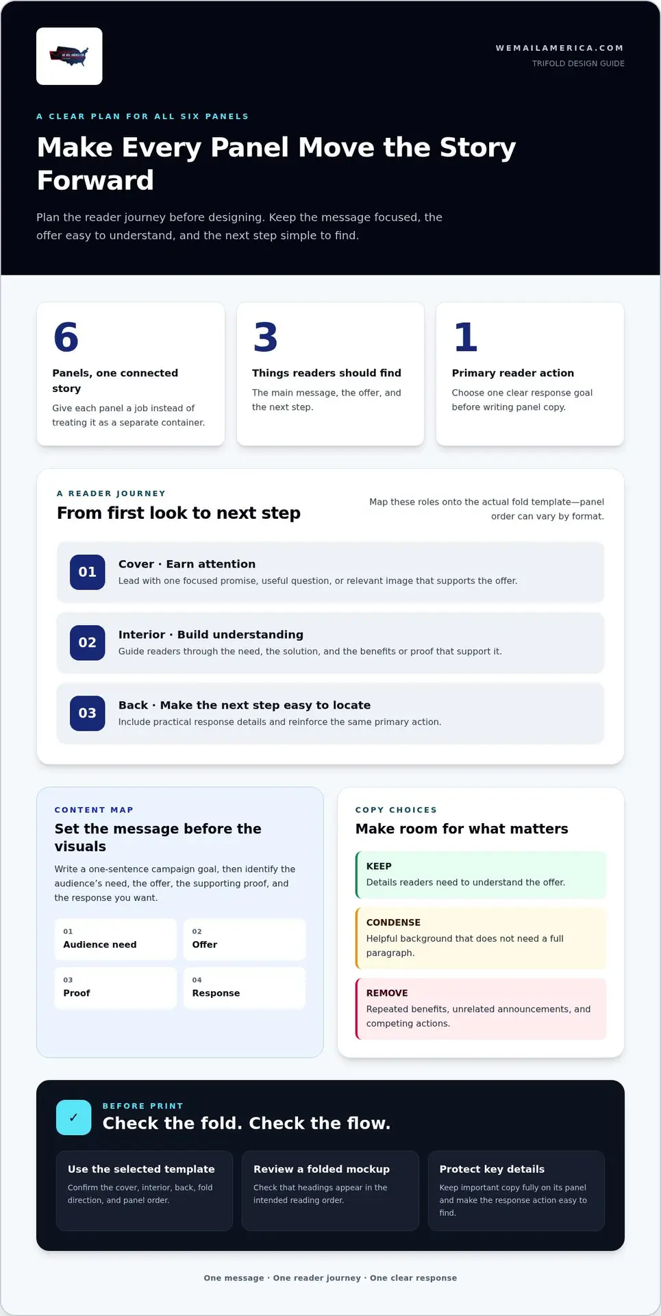
An effective trifold makes three things easy to find: the main message, the offer, and the next step. Each panel has a job. Rather than squeezing every product detail, company fact, and promotion into the available space, begin with the audience and campaign goal. What does the reader need to understand, and what do you want them to do after reading?
That decision shapes the whole piece. A brochure meant to explain a service may give more room to benefits, process, and answers to common questions. A brochure designed to prompt a response should make the offer and action especially prominent, whether that means requesting information, calling, or redeeming a promotion. Both can inform, but one clear priority keeps supporting details from competing with the main purpose. For a broader overview of brochure formats and uses, see What is a Brochure?
Think of the panels as a sequence, not six separate containers. The closed cover earns attention with a focused promise, useful question, or relevant image. When the reader opens the piece, the reveal should reward that interest with a clear reason to continue. The interior spread can build understanding in a deliberate order, such as need, solution, and proof. The back panel can carry practical details and reinforce the next step. This journey helps readers move from curiosity to confidence, then toward action.
What should a trifold brochure accomplish?
Choose one primary reader action before writing panel copy. For example, a home-services company might want homeowners to request an estimate for a specific service. Put the audience’s relevant need near the beginning, rather than after a long company history. Use the remaining space to explain the offer, answer important questions, and support the decision with concise details. If a fact doesn’t help readers understand the offer or take the next step, consider leaving it out.
How do folds affect the reading experience?
Folds control what readers see first and what they discover next. A closed piece introduces the message before the interior is visible. Opening it can reveal additional information in stages or as one broader spread. Plan that sequence using the actual fold direction, not a generic diagram. Panel widths and order can vary by format, so use the selected production template to identify the cover, interior, and back panels before placing content.
That planning is central to how to design an effective trifold. Print a paper mockup or use a folded template to check the reader’s path. Confirm that headings appear in the intended order, key details sit fully on their panels, and the response action is easy to locate. A strong design doesn’t ask readers to work out where the story goes. It leads them there.
Plan the Trifold Panels Around One Clear Message
Before opening a design tool, write a one-sentence campaign goal. Then list the audience’s main need, the offer that addresses it, the proof that makes it credible, and the response you want. This quick content map gives every panel a purpose. It also makes it easier to spot details that are interesting but don’t help readers understand the offer or decide what to do.
Build the story before choosing decorative elements. For a dental practice promoting new-patient appointments, the central message might focus on making it easier to book a visit. The brochure can then explain the appointment offer, highlight relevant benefits, answer a common concern, and show readers how to schedule. Keep the example focused on one audience and one objective rather than mixing in unrelated services or promotions.
What belongs on the cover, inside panels, and back?
The cover should quickly signal who the brochure is for and why opening it is worthwhile. Use one promise, question, or image that directly supports the offer. Inside, arrange the material as a short narrative: introduce the need, present the solution, then use benefits or proof to help readers evaluate it. Save practical response details for a panel readers can find after reviewing the offer.
Panel roles depend on the chosen fold, so map them on the production template instead of assuming every panel will be viewed in the same order. Label each panel in a rough outline before writing final copy. A useful draft might assign the cover to the promise, interior panels to the explanation and benefits, and the back to contact details and a repeated response prompt. Adjust the sequence to fit the actual format.
How can you prioritize copy without overcrowding panels?
Give each panel one main point. Support it with a short heading and only the details that move the reader forward. Break long explanations into brief paragraphs or purposeful lists, and remove repeated claims. If a sentence doesn’t clarify the need, offer, proof, or next step, cut it or move it to a more appropriate channel.
- Keep: information readers need to understand the offer.
- Condense: background details that support the decision but don’t need a full paragraph.
- Remove: repeated benefits, unrelated announcements, and secondary calls to action.
Use one primary response action throughout. You can repeat the same instruction where it helps readers act, but avoid giving equal emphasis to several competing options. For example, if the goal is to request an appointment, make that action consistent in the offer copy and response panel. The practical foundation for how to design an effective trifold is a disciplined message map, not filling every available space.
Once the content outline is clear, one-on-one design support can help translate it into a panel plan that fits the selected format. We Mail America provides trifold design support as part of its direct-mail services. Businesses preparing a direct-mail piece can discuss a trifold mailing campaign as the message moves from draft to production.
Choose Typography, Images, and Contrast That Make the Trifold Easy to Scan
A reader should be able to glance at a panel and quickly spot its main point. Visual hierarchy creates that path: the main promise gets the strongest emphasis, supporting information comes next, and response details remain easy to locate. Size, weight, color, spacing, and placement all help establish priority. If every element is bold or oversized, nothing stands out.
How should typography and color support readability?
Keep type choices under control. Assign a consistent role to each style, such as one treatment for headings, another for body copy, and a restrained accent for key details. Use clear contrast between text and background, especially for offer terms and contact information. Avoid placing essential copy over busy photography. Then review a printed proof at actual size. Type that looks comfortable when enlarged on a screen may feel cramped on paper.
Make the hierarchy visible without relying on color alone. A clear heading, concise copy, and intentional spacing can still guide the eye if a reader sees the piece in different lighting or has difficulty distinguishing colors. Keep emphasized details selective. If every sentence is highlighted, readers lose the signal that tells them where to look first.
How do images and white space improve the layout?
Choose visuals that explain or reinforce the offer. A relevant image can help readers recognize a product, service, or intended result. A decorative image that adds no meaning uses space without advancing the message. Give headings, paragraphs, and the response element breathing room. Avoid stretching small or low-quality files, and keep faces, logos, and other focal details clear of fold lines.
Use this quick review to catch common layout problems before approval:
- Purpose: Lead the eye from promise to supporting detail to response. Risk: Competing headlines make every panel feel equally important. Adjustment: Give the primary message the strongest type treatment and reduce emphasis on secondary copy.
- Purpose: Keep essential copy readable. Risk: Low contrast or text over a busy image slows scanning. Adjustment: Simplify the background or place text on a clean, high-contrast area.
- Purpose: Use imagery to clarify the offer. Risk: Decorative or stretched visuals distract from the content. Adjustment: Choose a relevant, sharp image and leave room around it.
- Purpose: Protect focal details. Risk: A fold cuts through a face, logo, or important text. Adjustment: Keep those elements within a single panel and review the folded proof.
For print, prepare images at 300 DPI at their final placed size. Check the file at the size it will appear, not just while zoomed in. The practical test for how to design an effective trifold is simple: can someone scan the piece, understand what matters, and find the next step without struggling?
Use This Step-by-Step Workflow to Prepare a Trifold for Print
A print-ready trifold comes together in stages. Set the campaign direction first, then build and review the artwork against the selected format. This keeps copy, folds, and production requirements aligned before the file moves to printing and mailing.
What should you decide before designing?
Write down the audience, campaign objective, core offer, and one primary response action. Gather approved copy, brand assets, contact details, and image files before laying out panels. Choose the intended trifold format: 8.5×11, 10×17, or 10×21. The dimensions and fold style determine how panels fit, so use the matching production template from the start.
Follow this workflow in order:
- Set the brief. Define who the piece is for, what it should communicate, and what action readers should take.
- Map the content. Assign copy and visual elements to panels before opening the design file. Keep the message sequence consistent with the chosen fold.
- Use the correct template. Start with the production template for the selected size and fold style. Confirm panel boundaries, fold direction, and any designated mailing area.
- Build the design. Place approved copy and assets within the template. Keep essential information clear of folds and trim edges, and prepare the file using the production requirements for color mode, image quality, and fonts.
- Review a proof. Check the artwork on screen, then review a folded proof to see how the piece works in hand.
- Hand off production files. Provide the approved artwork and any required supporting details in the requested format. Keep the final proof with the campaign records.
What should you review before approving the artwork?
Read the folded proof in sequence. Confirm the cover, interior panels, and back appear in the intended order. Check spelling, offer details, contact information, and response instructions. Inspect image quality, logos, and alignment at actual size. No essential copy or focal detail should sit across a fold or too close to a trim edge.
Use the selected production template to verify bleed, safe areas, panel dimensions, and mailing-panel specifications before approving the file. These details can depend on the chosen format and fold, so don’t rely on measurements copied from a different layout. Keep the address and other mailing elements within the designated area, and make sure they remain easy to read.
A final review should catch both design issues and production gaps. Confirm that the approved proof matches the file being handed off, and resolve any template warnings before printing. We Mail America provides one-on-one trifold design support and coordinates printing and mailing for direct-mail campaigns. Explore one-on-one trifold design support for your campaign.
Turn an Effective Trifold Design into a Nationwide Direct Mail Campaign
A trifold is a strong fit when an offer needs more room than a single-panel mailer can provide. It gives readers space to understand a service, compare benefits, and review supporting details while keeping the response action connected to the message. The finished design is only one part of the campaign, though. Its audience, delivery plan, and follow-up path should reinforce the same objective.
How does design fit into the full mailing process?
The campaign goal and intended audience shape the creative choices. They influence which need appears first, which images feel relevant, and what response action makes sense. We Mail America supports businesses across the United States with one-on-one trifold design support, printing, routing, mailing, and tracking. EDDM® and targeted-mail approaches connect the finished piece with a planned audience.
That coordination matters. A design created for a broad mailing may emphasize a different message than one prepared for a defined audience. Route planning can inform how the mailing is organized, while the artwork should keep its offer and response instructions consistent for the people receiving it. We Mail America creates a Custom Geographic Report and carrier-route map for each client as part of campaign planning. Daily tracking updates help businesses follow mail delivery.
Keep the handoff between creative and campaign planning simple. Align the final artwork with the selected audience and mailing approach before production. That way, the message readers hold in their hands supports the campaign’s purpose and feels consistent with its targeting and response path.
What is the next step after the design is ready?
Review the finished piece as part of the whole campaign. Confirm that the offer fits the intended audience, the response action is clear, and the selected trifold format supports the amount of information readers need. For additional context, the brochure marketing guide can help frame the format’s role, while the Sizeable Trifold buying guide can help readers consider that option for a campaign.
With design, printing, routing, mailing, and tracking coordinated, there are fewer moving parts for your team to manage. We Mail America brings those campaign steps together for businesses nationwide. The goal is straightforward: put a clear, tangible offer in front of the intended audience and make the next step easy to act on.
Start planning your direct mail campaign with a coordinated design and mailing plan built around your audience and objective.
Move from Trifold Planning to Campaign Action
Your next step is to turn the design into a clear campaign decision. Define what success should look like for your business, who needs to receive the message, and what response you want to encourage. That focus can guide choices about the trifold format, offer, mailing approach, and follow-up, so the printed piece has a job beyond looking polished.
Keep the first campaign plan practical. Bring your objective, audience, and approved artwork together, then make sure each supports the same outcome. If you’re still deciding how to design an effective trifold for your offer, use your campaign goal as the filter: keep what strengthens the message and remove what distracts from it.
We Mail America can connect your trifold plan with the next steps in direct mail. Start planning your direct mail campaign and move forward with a clear direction. A focused plan gives your message a stronger path from your hands to your audience’s mailbox.
Frequently Asked Questions
How do you design a trifold brochure step by step?
Start by defining the audience, offer, and one response goal, then sketch a panel plan before designing. For example, a campaign promoting a seasonal service could lead with the offer, explain who benefits, and direct readers to request details. Match the layout to the selected size and fold, then review a folded proof for sequence, readability, spelling, and contact details. Confirm the production specifications before approving the final artwork.
What should go on each panel of a trifold brochure?
Give the cover a reason to open the brochure, such as a direct benefit or question that speaks to the intended reader. Use the inside to answer the reader’s natural follow-up questions, moving from the need to the offer and its supporting details. Put contact or response information where it’s easy to find after the offer is understood. Since fold direction changes the panel sequence, map the content on the selected template.
How do you make a trifold brochure look professional?
Use a consistent set of fonts, colors, and image treatments so the panels feel like parts of one piece. For example, repeat the same heading style for each service benefit instead of giving every panel a different look. Keep alignment consistent and leave space around important content. Before printing, inspect the piece folded and flat. This can reveal uneven transitions, crowded edges, or small details that are easy to miss on screen.
What is the best size for a trifold brochure?
The right size depends on the amount of information, the role of visuals, and how the brochure will be distributed. We Mail America offers trifold formats in 8.5×11, 10×17, and 10×21 sizes. A compact format may suit a focused offer, while a larger format can give detailed menus or service information more room. Plan the content for the chosen dimensions, and use its matching template rather than stretching a finished layout.
How much text should a trifold brochure have?
Use only enough copy to explain the offer and help readers choose a next step. A practical test is to read each panel heading by itself: the headings should still communicate the brochure’s basic story. If they don’t, revise the hierarchy before adding more text. Keep supporting explanations brief, and remove duplicate benefits. For a panel that feels dense, simplify the wording before shrinking the type, so readers aren’t forced to strain.
Should a trifold brochure include a call to action?
Yes, a brochure should tell readers what to do after considering the offer. Choose an action that fits the campaign, such as calling, visiting a website, or scanning a QR code. We Mail America includes a custom QR code on every direct-mail campaign. If you use one, state what readers will get after scanning and make sure the destination fulfills that promise. Keep the instruction and contact details together where possible, so readers don’t have to search across panels to respond.
How do you prepare a trifold design for printing?
Prepare the file using the production template for the selected format and fold. Before approval, check that the panels appear in the right order, essential content stays clear of folds and trim edges, and images remain sharp at their placed size. Proofread names, phone numbers, web addresses, and offer terms carefully. Use the production specifications to verify bleed, safe areas, and any mailing-panel requirements, since these depend on the production setup.